It is an Easter weekend of self-isolation in the UK, with the EFL season on ice, for now.
Easter is usually a deciding weekend in promotion and relegation battles, but that entertainment will come later in the year following the outbreak of Covid-19.
However, despite the fact there's no football this weekend, we've got you covered at Football League World, as we go back looking at some of the worst kits in the EFL from over the years.
Take a look through our gallery and pick your favourite, or the one you'd love to see your side wearing in 2020/21...
Famed for their famous black and white stripes that Juventus even copied, this effort from Notts County moves away from tradition, looking a little bit more like a picnic blanket than a football kit.
Honestly, we can't see Juventus following this trend anytime soon...
Anyway, onto the football displayed in this number, which was almost as grim as the kit.
County were playing in the First Division in 1994-95, but finished 24th and suffered relegation, a mammoth 14 points adrift of safety.
A year to forget for the players and fans.
This Stockport County strip caught our attention (it was hard not to really).
Whilst there is nothing wrong with a blue and yellow colour scheme, the way they are thrown onto the kit resembles something from a Primary School art lesson.
However, it was worn during the reasonably successful 1991/92 season, where Stockport finished fifth in the Third Division.
They were only behind Brentford, Birmingham City, Huddersfield Town and Stock City after 46 games, winning over 70 points.
However, there were only seven victories on the road, alongside a whopping 11 defeats.
Ah, Huddersfield Town. Their Paddy Power effort this year got the national media talking and fans fuming, but imagine what the Twitter meltdown would've been like when this was released.
Blue and white stripes, yes, but a big white panel doesn't scream Huddersfield Town.
During the time of wearing this 'Matchwinner' kit, Huddersfield Town suffered relegation to the Third Division (1988), before finishing 14th the following year and failing to bounce straight back.
The current crop have had a bad start to the season and there will be hope that another year that's remembered for the kit doesn't result in relegation.
To some, this won't seem too bad. Exeter's effort is very similar to the Leeds United away kit of 2018/19, even if it wouldn't look out of place in one of the city's vintage shops.
Unlucky to make the list, but is on there because of how 'out there' it is.
It'll also be remembered for featuring in a bad year on the field too.
Exeter wore this kit during the 1992/93 season, when they endured a tough old year in the Second Division.
Only winning 11 games all season, the Grecians finished 19th in the league with 50 points, only three above the relegation zone.
Scunthorpe's 1994 effort screams what the decade was all about.
Bold colours and patterns and an interesting sponsor to match.
You could see some Irons fans wearing this listening to early Oasis, admit it.
Moving onto matters on the pitch when this number was kicking around, Scunthorpe enjoyed a fairly good season in the Third Division.
After 42 games, they amassed a respectable 62 point haul, which saw them finish seventh, only three points adrift of the play-off places.
Like the above, this screams of the era.
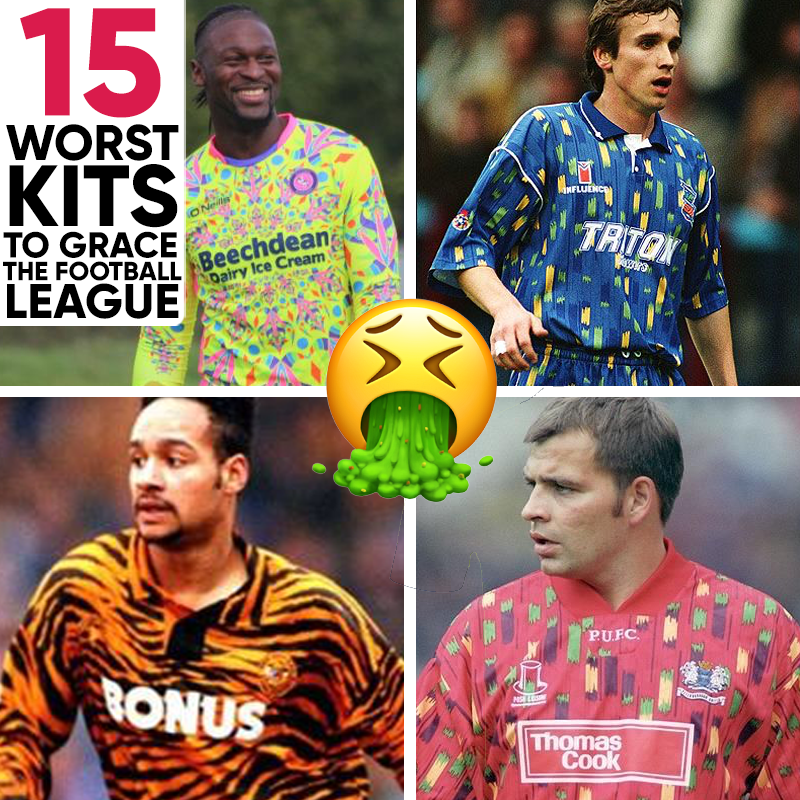
Posh's recognisable blue is nowhere to be seen, with reds and greens taking centre stage on this kit.
The old Thomas Cook (making the news for all the wrong reasons now, of course) logo adds to its general goriness.
Another that follows the trend of Scunthorpe and Peterborough, but this time from Birmingham City.
Yes, their traditional blue is there, but the random marks over the top give it a very 90s feel.
Additionally, what's going on with the club's badge? Orange and green?
On the field, Birmingham managed to finish 19th in the First Division of 1992/93.
The Blues won 34 points playing at St Andrew's in this kit - 10 wins and four draws, with that form keeping them in the division that particular year.
Only three wins were recorded away from home, alongside eight draws.
Traditional Wolverhampton colours, but it still looks a mess.
It looks like your standard Wolves kit, but it has been caught with someone waving black paint around.
Goodyear on the sponsorship, but not a good year in terms of kit selection.
Like Birmingham's from the year before, this featured in the First Division in 1992/93.
However, Wolves performed slightly better on the whole, finishing 11th with 61 points. 11 home wins were recorded, alongside six draws and six defeats.
A much more recent effort from Stevenage.
The Burger King sponsorship is something you don't see very often in the EFL, and the red and yellow stripes appear to represent ketchup and mustard.
Clever if that was the idea, but we aren't sure it was...
At the time of writing (25.09.19), Stevenage aren't in the best of positions.
They are rooted to the of the table, with only four points from the opening 10 fixtures of the season.
A goalkeeper kit from current League One outfit, Sunderland.
It's hard to even explain what is going on in this mid-90s effort, but the fact it was around for two years puzzles us.
Imagine the uproar at the Stadium of Light if this was released now.
Worn in the 1994/95 season, Sunderland narrowly avoided relegation to the Second Division, finishing 20th and six points clear of the drop zone.
If that was a near miss, what followed was unexpected, as Sunderland romped to the First Division title in 1995-96.
That makes the goalkeeper's kit something of a favourite? No?
Bury have been making headlines recently after they were expelled from the EFL, so in many ways, it is nice to be writing about them again.
This purple, green and white effort makes our shortlist for obvious reasons.
They were playing in the Third Division when sporting this particular number, and were much more of a hit on the field than they were off it.
Bury finished seventh, just outside the play-offs, after winning 63 points across the season.
No 'worst ever kits' list would be complete without an effort from the Tigers.
We get that Hull City are nicknamed 'The Tigers' but there's really no need to make it this obvious.
To us, this looks like it might be better suited to an Eastenders favourite.
Hull were a second division side the year that they wore this kit, winning 68 points and finishing five outside the play-off places in ninth.
A bit of a 'meh' year on the pitch, but their kit caught the eye.
Another modern effort from Wycombe Wanderers.
There's nothing wrong with a goalkeeper kit that's made to standout, but again, we are questioning the pattern of choice over the yellow.
Confusion all around, but not for the players.
The 2017/18 campaign was the year Wycombe were promoted out of the fourth-tier, with Gareth Ainsworth leading the club to third and League One.
Their goalkeepers might've shipped over 60 goals, but it didn't matter as an electric attack outweighed that.
Norwich City are famed for their canary yellow kits, and this away strip has a touch back to tradition with the yellow and green.
However, we can't help but feel the kit would've been fine as a standard white without the yellow and green splashes. A definite 90s throwback.
Much was expected of Norwich in this kit, but they managed to finish only eighth in the Championship during the 2016/17 campaign.
There was little to play for heading into the business end of the season, despite finished just two places outside the play-offs, but they did manage to hinder Leeds' efforts to make the top-six.
Every cloud has a white shirt with green and yellow smudges. Or something like that...
Finally, Grimsby Town complete our list.
Nothing wrong with a pink strip, but with the stripes across the front, this is just ugly to look at and very 'out there'.
It's hard to imagine too many of these were sold, although Grimsby finishing in mid-table might've helped.
League Two always threatens to pull you into a relegation fight, but Town put together 51 points from their 46 games, which pulled them to 18th in the table.
They were sitting pretty in the table and looking rather bold on the pitch.